If it seems surprising to talk about the aesthetics of Occupy, it shouldn’t. This is a movement that uses the term “beautiful” as one of high praise in a non-ironic way. Nonetheless, this is not the beauty so prized by the art world. Occupy has made an aesthetic from being out of place that has come to have a noticeable affect in the run up to May Day.
I’m describing Occupy as aesthetic in the sense of Rancière and, as he would say, the Greeks. Rather than signifying beauty, as it would for Kant, he intends
an “aesthetics” at the core of politics …as the system of a priori forms determining what presents itself to sense experience.
That is to say, if politics is the determination of relations between the visible and the sayable, there are certain forms that determine what can be “seen” and what is kept out of sight; between what may be said and what cannot; between what is said and understood, and said and not understood; and, finally, how we determine what it is to call something visible and sayable.
It is, then, not for nothing that the sign became Occupy’s first and perhaps most noticeable form. The classic Occupy sign is made on cardboard torn from a box and not bought specially from an art shop. It’s written in felt tip or Sharpie. The point is that it says something distinctive and interesting. One of my favorites:
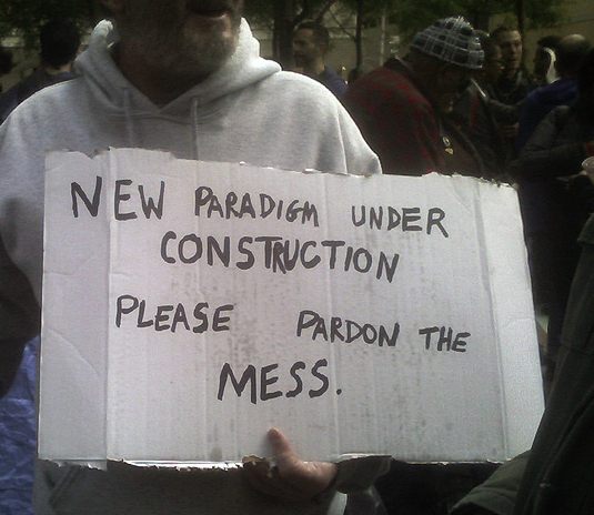 This sign expresses what many were feeling at the time of the Liberty Plaza occupation and does so with wit and intelligence: it makes you smile and it makes you think. For some art world people, this is a “hand-made” aesthetic, perhaps a little past its sell-by date. My guess is that the person who made this is utterly unaware of that narrative and if they were, they could care less. This object was made to be seen but not displayed, let alone sold.
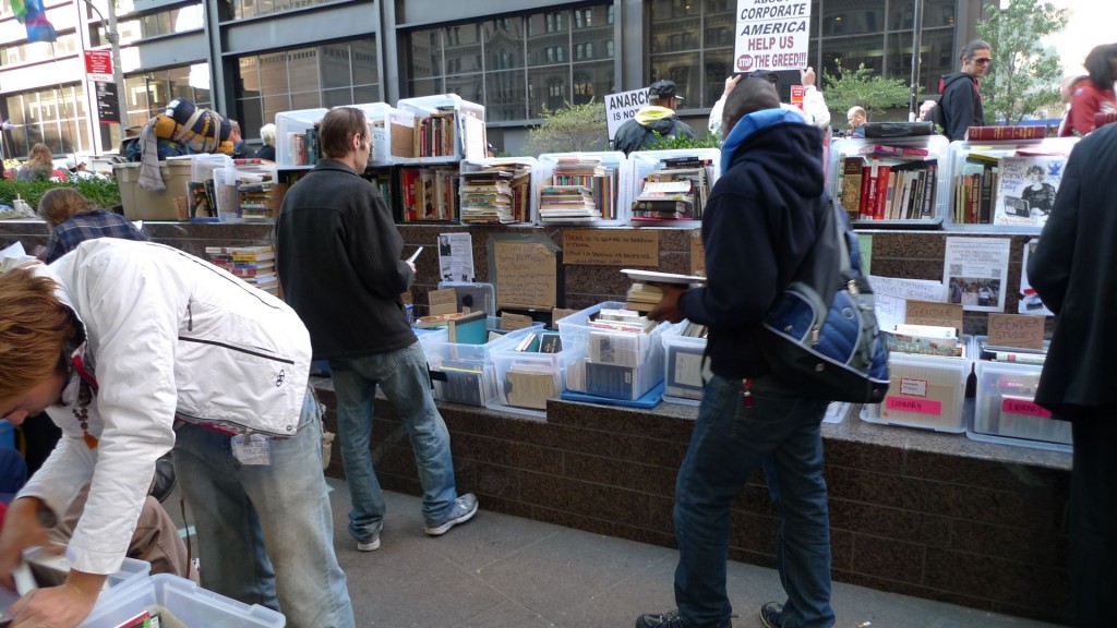
To really understand the aesthetics of Occupy, you have to get into what it means to say, for example, that the OWS library was beautiful.
Which it most certainly was. In part, that’s because it was a library that did not discipline its readers. It knew what it had, and what it had lent, but no one was under obligation to return a book if they liked it. There were no fines or people telling you to be quiet. More even than that, there was a sense that this was beautiful because it was out of place, unlikely and untypical. It challenged our sense of “what there is to see there” and, like all the Occupy sites, turned drab anonymous space into a place that had a certain magic to it.
You need to have felt that magic, which I’ve discussed before as being the gift economy of Occupy that worked even though it wasn’t supposed to do so, to get the varied ways that May Day has been imagined. On the lovely Occuprint May Day site, there are noticeably no Social Realist images, other than a few clenched fists, mostly from Oakland, where there is a historical tradition of radicalism and Black Power. More typical is this popular poster in NYC at the moment by Ethan Heitner (by the way, I don’t know any of these artists):
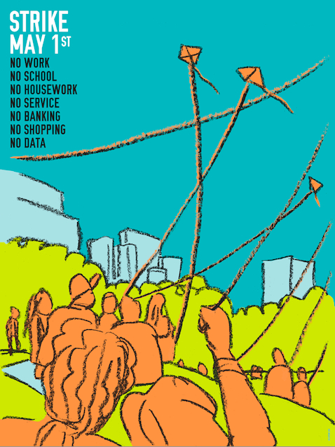 The hand-drawn image of kite-flying in a park on a sunny day nicely sets off the crisp graphic. It’s not whimsical, though. It’s after that “magic” that the aesthetics of Occupy offered: you shouldn’t be in the park flying a kite–an odd American insult is “go fly a kite”–you should be doing one of those things you’ve decided not to do for one day.
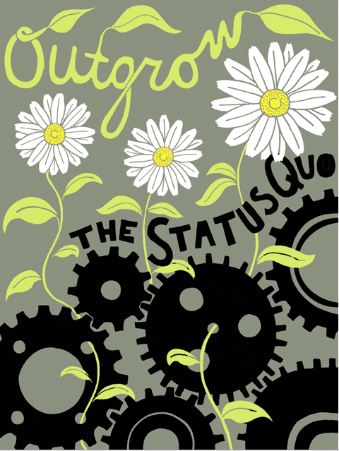
The image chosen for the most widely disseminated May 1 leaflet shares this aesthetic:
In this image, Nina Montenegro turns the “daily grind” into a visual image out of which new shoots of Spring are growing. The received image of the general strike, whether from Seattle on 1919 or Russia in 1905, could not be more different than such feminist imagery. It says a lot about what OWS thinks itself to be that it was selected.
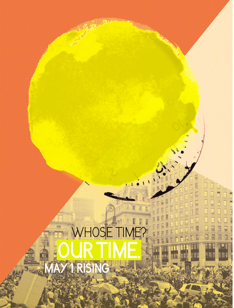
Last, and perhaps by a short head my favorite, is one I’ve already posted but here it is again:
Elizabeth Knafo and MPA have created a visualization of a theme that I’ve often discussed here–the sense of “movement time,” the way in which we’re reclaiming our time, both day to day, hour to hour and in general. The combination of a simple hand painted sun eclipsing the clock by which our lives are dictated and bringing a warm yellow light to a mass direct action: “Whose Time? Our Time.”
The posters tell a story of a movement that has indeed moved: seeds, flowers, women, the sun, kites, machinery only as the past, clenched fists to recall past actions. I’d rather see no fists at all, true, but it’s only been six months.

Pingback: A May Day in the Life | Occupy 2012
Pingback: Stone Links: A Physicist's Flap - NYTimes.com